Facebook Portal TV took the Smart Camera technology developed for the gen 1 Portal products and brought it to the biggest screen in your home, the television. This created an extremely immersive and compelling user experience while smartly leveraging an existing screen in your home rather than having to add another.
I worked on Portal TV from concept through to mass production.
Mini was the first Portal product with an 8” display. The idea was to create a device that seamlessly blended with its surroundings. We took design cues from the picture frame, an object that feels natural in any home environment.
I worked on Portal Mini from concept through to mass production.
With three generations of successful products on the market in 4 years, Bould Design was uniquely positioned to work with Roku again on their latest set top boxes, the new Roku 2 & 3. Roku products are famous for their curvaceous and fun aesthetics. We were tasked with evolving the aesthetic and pushing the design language to feel more refined and premium, whilst maintaining the personality and character associated with Roku products.
my role: Lead Designer
Early concept sketches and 1:1 SLA prints. I explored new form factors that pushed the design language, and also designs that stayed a little more honest and true to Roku.
A small collection of my early design concepts.
Roku decided to stick with a more familiar form factor. This image illustrates some form studies I did. I ended up straightening the side walls of the device and moving away from the more curvaceous form factors. The more angular design made the product feel more refined and premium.
Roku products are inherently simple. They get their character and personality through their whimsical form, styling and CMF. This image shows a range of 3D prints I created to review such details with Roku, and start to down select concepts.
The final design paid homage to previous generations of Roku box, but was the most simple, elegant and sophisticated incarnation yet. The subtle asymmetric form gave the device directionality, and the high gloss finish allowed the device to seamlessly blend in with its surroundings. All details and part breaks were heavily iterated upon to make the final form harmonious and uncompromisingly simple.
Hero 5 is the newest and most powerful action camera from GoPro, released in October 2016. This was the first major form factor overhaul for the Hero Black camera line. I spent 2 years working on the design and development of the device.
my role: Worked collaboratively with Design Director, taking the project from concept through to mass production.
Remembering where we came from. This was the first opportunity we had to evolve the form factor of the Hero range. We wanted to create a device that pushed the form factor but still stayed honest to the GoPro design DNA.
Appealing to the masses. We wanted the Hero 5 to appeal to a larger more diverse user base. With this in mind we set out to simplify the design, with the intention of taking away the intimidation factor, or complexity some people struggle with when using a GoPro.
Hero 5 was going to be waterproof out the box, you no longer needed to place the camera in the GoPro Dive Housing Accessory. With this in mind I took some design cues from the Dive Housing and applied them to the camera. This would insinuate to the user that the camera as a stand alone entity was waterproof, durable and robust.
Once I had locked on a general form factor, I spent a lot of time iterating on part breaks and surface geometry. I wanted the camera to have as few parts as possible, minimizing the amount of water seals needed, thus allowing the camera to be a small as possible. Minimizing the part count also meant the device looked simpler and more cohesive.
GoPro cameras are used in places and situations unique to consumer electronic devices. With that in mind I spent a lot of time developing a CMF able to withstand the intense enviroments our cameras live within.
We created a brand new color scheme for the Hero 5. I spent time on the ground in Taiwan mixing colors at our resin and color suppliers. This image shows some of the many trial parts I made during this process.
Alongside the Hero 5 Black, GoPro also released a refresh of the smaller Hero Session camera. This project was unique in that the form factor was not going to change due to time constraints. Instead I was tasked with refreshing the color, improving finishes, and making very slight hardware modifications to improve the
user experience.
my role: Lead Designer
I spent a lot of time working with new materials and finishes on the camera to make it more durable. For example we moved away from black e-coating on parts used PVD instead. We found the PVD finish with a clear hard coat wore a lot better in our abrasion tests. The camera on the left is the old Hero Session, the one on the right is the new Hero 5 Session.
I wanted the Hero 5 Session to compliment the new Hero 5 Black color scheme (grey). With this in mind I created several ID cosmetic models in various hues of grey and silver so I could evaluate them. This image shows some early ID models, you can see the subtle change in color.
Every detail on the camera was iterated upon. This image shows a varying range of shutter icons. Each is a different stroke weight and diameter. I ordered rubdowns (transfers) and applied them to spare housings. We evaluated the options as a team and selected the one we felt proportionally looked best then rolled it into mass production.
I took this image during a trip to Taiwan where I was working on both the Hero 5 and Hero 5 Session colors. The 8 plaques at the top of the image were a grey hue range I created that day. Two of these colors eventually went on to be used at mass production. All parts were reviewed in a light booth at the factory and I incrementally adjusted the color LAB values to get the range I needed.
I spent a lot of time in China and Taiwan working with our anodizing factories to dial in the new metallic grey used on the front lens bezel. I worked with our TPE supplier to mix new greys for the housings, and with our paint and PVD suppliers to improve the durability of part finishes.
Tempur-Pedic, one of the world’s biggest mattress manufacturers, wanted to develop a new wireless remote control that would allow a user to incrementally adjust the angle of their bed for comfort.
my role: Lead Designer
Early design sketches and 3D CAD concepts.
Simplicity was of the upmost importance because this device would be used in low light conditions. This image shows some of my more refined early 3D concepts.
The buttons were arguably the most important feature on the controller. I looked at various configurations and contouring of the button surfaces to enhance usability. Through several rounds of user testing I found the best solution was to have the 2 separate buttons in a vertical setup with the ‘down’ button being concave. This simple tactile feedback proved to be universally liked, and easily understood. I then placed the 3rd Bluetooth button (used infrequently) on the rear face as to not confuse the user.
Being a small handheld device it was essential it felt comfortable to hold and was correctly proportioned. I printed out several forms to test overall comfort in varying sized hands.
The more angular forms on the charge dock allowed me to drastically reduce its size because very little space was left between the inside walls and the PCB . I angled the locating feature on the dock so the remote rested on a 20° angle, this made it feel more natural to pick up.
The final design has an elegant and seamless form factor that is extremely comfortable to hold in either hand. The contoured buttons juxtapose the smooth form making them incredibly easy to locate even in complete darkness. The small LED sits atop the device displaying charge status, and providing a visual reference in low light. The simple neutral form factor is devoid of unnecessary styling, giving the design longevity. The CMF is simple as to not draw attention to itself, so it blends seamlessly into its surroundings.
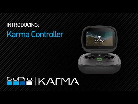
GoPro recently released its first drone, KARMA. I spent 2 years designing and developing the KARMA controller, taking it from concept through to production. The goal was to design the most compact and user friendly system on the market.
my role: Lead Designer
I saw this project as a great opportunity to redefine the experience of flying a drone, and to help take away the intimidation factor associated. This is still a relatively new industry and I believe their are several opportunities to innovate. I wanted to create the most simple and intuitive controller that would enable rather than confuse the user.
I had very little experience flying drones when I began this project, so had few preconceptions as to what a drone controller should be. I spent hours testing competitive products trying to get a better understanding of their pain points.
Drone controllers are inherently technical and intimidating products. I appreciated the simplicity and fun nature of gaming console controllers. I wanted users to enjoy a similar experienece when they used the KARMA controller.
The screen. The defining moment of the project was the decision to add a touchscreen to the controller. This allowed me to hand pick an LCD module suitable for bright sunny conditions. It also meant users would no longer have to mount their smartphone to the controller to access the UI, simplifying the user experience.
I didn't want any external screws visible on the controller so was insistent all parts mechanically snap together. This helped maintain a clean aesthetic.
I visited China several times during this project to meet and work with our manufacturers to make sure our industrial design intent and CMF was maintained thorough mass production.
The final KARMA product ecosystem
The Hero 4 was GoPro's premium action camera released back in 2014.
My role: Worked collaboratively with Design Director, taking the project from concept through to mass production.
Because the overall form factor needed to remain the same I spent most of my time iterating on the smaller details. I explored new color palettes, knurling/ texture patterns, LED positions and shape, rear LCD position, heat sink geometry and speaker/ mic perf design. This image shows a small selection of cosmetic models I made to help validate these options.
This image gives a small insight into some of the details I worked and iterated on. Every external part of the camera was modified to improve the look, feel and functionality of the camera.
One of the biggest changes was adding a rear touch screen to the camera. For the first time this allowed users to frame and review their images.